Case Studies:
dr.jart — brightamin
This project for dr.jart, one of the most well-known and established derma cosmetic brand in Korea.
In order to actively express the core concept of this project, a fresh and powerful vitamin C product, we used the shape of a nutritional supplement as a development motif and developed a shape that can hold dual vitamin tablets in the cap of the ampoule container so that users can immediately mix it with the product. We developed packaging that can be used without destroying the daily vitamin and applied it to the design.
Case Studies:
LION — RAWQUEST
THE DESIGN WITH THE THEME “STREAM OF TIME” WAS INSPIRED BY THE SUNDIAL, THE MOST PRIMORDIAL SYMBOL OF TIME DISCOVERED BY MANKIND. WE APPROACHED THE DESIGN FROM A BRAND DESIGN PERSPECTIVE RATHER THAN A PRODUCT PERSPECTIVE, FOCUSING ON VISUALLY EXPRESSING THE OVERALL APPEAL OF THE PRODUCT ITSELF THROUGH SHADOW EXPRESSIONS THAT MAKE THE PRODUCT APPEAR THREE-DIMENSIONAL.
Case Studies:
HUMAJOR —
DR. FOR HAIR
SCALP‒FRIENDLY (SCALP-FRIENDLY) HOME CARE SPECIALIST DR. FOR HAIR HAS BEEN REBORN AS A NEW, MORE POWERFUL PRODUCT WITH A PACKAGE RENEWAL FOR MORE EFFECTIVE BRAND COMMUNICATION. We developed a container design with a simple yet unique shape that reflects the brand's philosophy, gave a new layout so that consumers can recognize the product name, brand identity, and product description in order, and even refined the details of the typography to maintain a sense of unity. In addition, each line is designed with a different color to clearly distinguish it.
Case Studies:
inonn —
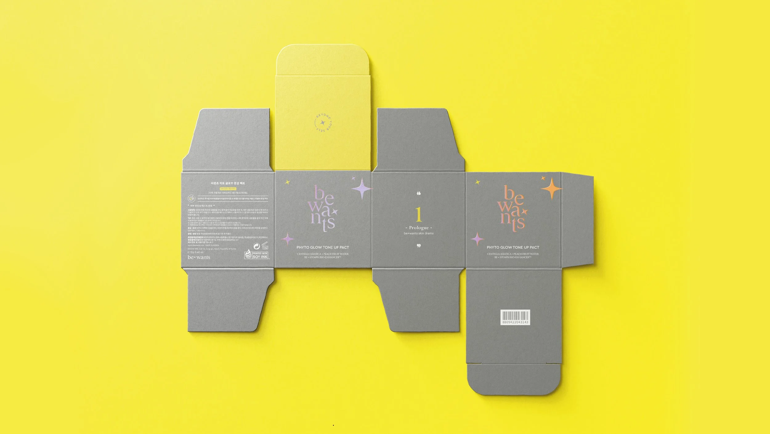
bewants
WE ESTABLISHED THE OVERALL BRAND DESIGN, INCLUDING LOGOTYPE AND PACKAGING, FOR THE BRAND “BE WANTS”. STARTING WITH THE MOTIF OF ‘LIGHT’, WHICH EMBODIES THE WISH THAT WHAT ONE WISHES WILL COME TRUE, THE LOGO DESIGN WAS COMPLETED AND THE BRAND SIGNATURE SYMBOL WAS COMPLETED. THE PACKAGING HAS IMPROVED THE COMPLETENESS OF THE PRODUCT BY ADDING SOLID POST-PROCESSING TO THE MATERIAL AND COLOR MATCH TO ESTABLISH IT AS A FASHION ITEM, AND THE B.WANTS SYMBOL IS ENGRAVED IN A HOLOGRAM AT THE TOP, CREATING A MODERN, EASY-TO-READ DESIGN THAT MAKES IT EVEN MORE ATTRACTIVE. IT WAS EXPRESSED TO GIVE A CONFIDENT FEELING.
Case Studies:
GNCO —
ETAPE
‘ÉTAPE’ REFERS TO THE JOURNEY TO FIND YOUR OWN SCENT, THE SCENT OF THE MOMENT THAT EXPRESSES YOURSELF. IN ORDER TO MORE EFFECTIVELY EXPRESS THE STORY SELECTED FROM ETAPE'S DELICATE STEERING AND THE SCENT THAT BRINGS BACK SPECIAL MEMORIES, THE PROCESS OF THE SCENT SLOWLY SPREADING IN THE AIR WAS INCLUDED IN THE LOGO, AND THE GRAPHIC WAS CREATED USING ELABORATE BUT ABSTRACT ARTWORK REMINISCENT OF AN OLD STONE BUILDING. IN THE PACKAGE DESIGN, THE FLEXIBLE RHYTHM OF FREEDOM IS EXPRESSED THROUGH BEAUTIFUL CURVES, AND THE CHARACTERISTIC FEATURE IS THAT IT IS NATURALLY CARVED FROM PURE GEMSTONES, ALLOWING YOU TO FEEL THE TASTE AND SENSIBILITY THAT CHANGE EVERY MOMENT DEPENDING ON THE CONCENTRATION AND SHADE OF THE BOTTLE CAP AND LIGHT.
grahic, packaging, branding & art work
grahic, packaging, branding & art work
project explor
CONTEMPORAR visual INTERPRETIVE
It all begins with an idea. We can do development for modelling, change core, mold design and delivery.
모든것은 아이디어에서 시작됩니다. 제품 패키지의 성공적인 개발과 생산을 위한 모델링 부터
금형개발까지의 전반적인 디벨롭먼트 분야를 포함합니다.
기술자문을 포함한 생산과 납품이 가능하기 때문에 많은 디자인 에이전시들과의 차별점을
갖고 있습니다.
Technical advice to produce high quality
dfuze design work on the fields of product design, grahic design and strategies. Please check more information and news.
우리는 기업의 비즈니스를 위한 브랜딩부터 패키징, 그래픽 디자인까지
여러 분야와 규모, 매체를 아우르는 프로젝트들을 진행하고있습니다.
INSPIRING STRENGTH AND BUILDING
Studio dfuze is a Seoul based graphic design studio founded in November 2011. We collect fragmented and straying thoughts, and then organize and transform them into relevant forms. Our capabilities include branding for corporate business, graphic design, packaging for sale and many others in various fields, sizes and media.
2011년 5월에 서울에서 만들어진 디자인스튜디오 dfuze는 생각의 조각들을 조직적이고 유의미한 형태로 만들어 나가는 과정과 그 결과를 제안합니다. 기업의 비즈니스를 위한 브랜딩부터 패키징, 그래픽 디자인까지 여러 분야와 규모, 매체를 아우르는 프로젝트들을 진행하고있습니다.
magazines, such as 『IdN magazine』, 『ampule』, 『Communication Arts』, and 『Design 360°』, featured our works and stories. Many online media, such as 『trenders』, 『Beauty post』, 『Dieline』 also featured our results.
dFuze의 프로젝트는 『아이디어』, 『ampule』, 『커뮤니케이션 아트』, 『디자인360°』 등 다수의 매거진, 『trenders』, 『Beauty post』, 『Dieline』 등의 온라인 매체에 소개되었습니다.
Design awards & competitions like the global package design Awards WPO, korea Design Awards, IF Design Awards, and Reddot Design Awards gave us prizes or selected our works.
우리는 글로벌 패키지 디자인 어워즈 WPO, KOREA 디자인 어워즈, iF 디자인 어워즈, 레드닷 디자인 어워즈 등의 다수의 디자인 어워드에서 수상하였습니다.


