CNP Laboratory
Skin Care line
CNP is a brand that embodies the know-how of skin experts who put skin health first under the slogan, ‘Cosmetics that make your skin healthier the more you apply it.’
차앤박은 ‘바를수록 더 건강한 피부를 만드는 화장품’이라는 슬로건으로 피부 건강을 제일로 생각하는 피부 전문가의 노하우를 담은 브랜드입니다.
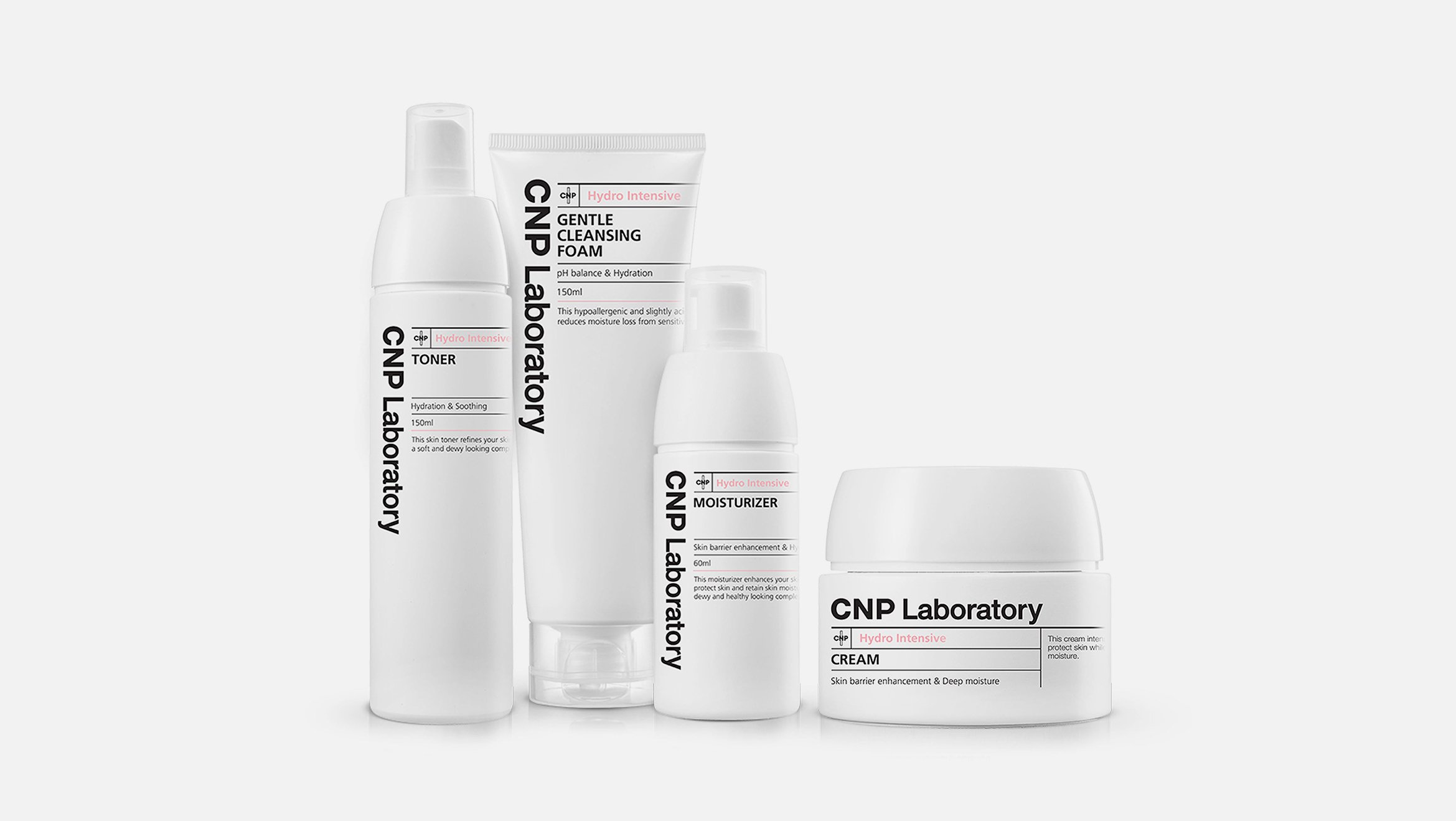
Through this design renewal, we sought to break away from our aging image and reinterpret our branding core to strengthen our group power and identity. In addition, the color line was differentiated from other lineups, and the functionality of the product was emphasized with simple yet refined graphics. Considering the target and channel, we established a new identity with a new green color that can be recognized as a signature color through strong contrast and attempted to maintain Minoxel's assets by upgrading the graphic elements of existing products.
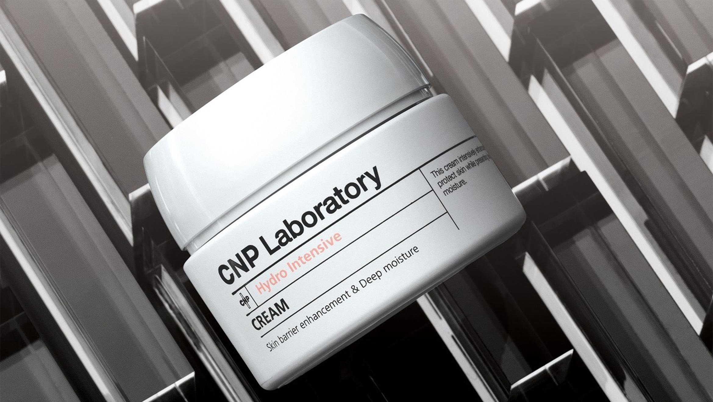
CNP는 차앤박 본원을 모태로 피부연구소에서 출발한 더마코스메틱 브랜드로써 정체성을 표현할 수 있도록 제품의 내용물은 물론 패키지와 용기에서도 기능적이고 전문적인 감성을 고객에게 전달하는 디자인을 연구하였습니다.
We considered the colors, shapes, and materials that encompass the brand and created a design identity that emphasized the feeling of medical derma care through a unified development for each product line.
브랜드를 아우르는 컬러와 형상, 재질을 고민하고 제품의 라인 별로 통일감 있는 전개로 의학적인 더마 케어의 느낌을 강조한 디자인 아이덴티티를 만들었습니다.


Client
LG Household & Health Care
Project Team
Product Design :
dfuze design
Package Development :
dfuze design
Displine
Design Application
industrial
Year
2014—2016